GPT Image 2 Poster Design: How to Build Better Concept Posters With a Smarter Prompt Framework
ImagineGo Team
4/30/2026

If you are searching for GPT Image 2 poster design, you are probably not looking for another vague “AI can make posters now” article. You want to know whether this model is actually useful for real poster work, why some prompts suddenly produce layout-aware results, and how to structure a prompt that gives you something closer to a concept poster than a random illustration. If you want to test that workflow directly, you can start on ImagineGo.
That is the right framing for this keyword. The interesting part is not that GPT Image 2 can generate attractive images. Plenty of models can do that. The real reason designers and creators are paying attention is that GPT Image 2 is much more usable when the image needs to behave like a poster: a large title, a clear subject, disciplined composition, readable hierarchy, and a visual idea that carries meaning instead of just decoration.
There is also one naming detail worth clarifying up front. In creator circles, people often say GPT Image 2 as shorthand for the newer OpenAI image generation experience with stronger text rendering and layout behavior. In OpenAI's official API documentation, the public model name is currently gpt-image-1. For search purposes, though, the phrase GPT Image 2 poster design is the one users are actively typing, so this article keeps that wording while staying precise about the workflow.
Key takeaways
- GPT Image 2 is interesting for poster design because it handles structure better, not just style better.
- Most weak poster prompts fail because they describe taste, not visual responsibility.
- The best prompt frameworks for poster work act like design briefs, not image wishes.
- A strong poster prompt should define semantics, composition, text behavior, color limits, and failure conditions.
- This matters most for concept posters, editorial-style layouts, print-inspired visuals, and title-led compositions.
- ImagineGo is useful when you want to iterate these poster directions quickly inside one workflow.
Why GPT Image 2 changed the poster-design conversation
The jump here is not only visual polish. The more important change is that the model is much more helpful when a composition depends on relationships between text, subject, scale, and space. That is why poster design is such a revealing test case.
In a normal AI image workflow, you can often get a “good-looking” image by describing style, mood, and a few objects. That approach breaks down when you need a result that functions like a designed surface. Posters are harder because the image is doing multiple jobs at once:
- carrying a message
- organizing visual hierarchy
- anchoring text in space
- creating emotional tone
- making the core concept legible in one glance
That is where GPT Image 2 feels more practical. On ImagineGo's own model positioning, GPT Image 2 is useful when the job depends on stronger text rendering, better layout awareness, and more reliable prompt obedience in commercial workflows. Poster design sits directly inside that category.
Why most AI poster prompts still fail
Most poster prompts fail for a simple reason: they ask for style, but they do not assign visual responsibility.
For example, many prompts say things like:
- cinematic poster
- bold typography
- minimalist composition
- high-end graphic design
Those words sound right, but they do not tell the model what each component should do.
That creates three common failure modes:
1. The image looks artistic, but not poster-like
The model gives you a nice visual, but the composition does not support a headline, a supporting surface, or a readable focal structure.
2. The text is treated as decoration
Instead of becoming part of the spatial logic, the text floats on top of the image like an afterthought.
3. The concept remains shallow
The prompt names a word, object, or mood, but does not explain the semantic tension behind it. The result is literal instead of designed.
This is why the long prompt framework you shared is genuinely useful. It does not merely ask for a “cool poster.” It behaves more like a design system.
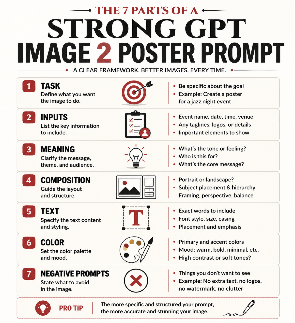
What makes this prompt framework so strong
The supplied framework works because it treats poster generation as a structured design brief. Instead of jumping from a word to an image, it inserts several layers of thinking in between:
- what the poster is trying to do
- what the word or phrase actually means
- what emotional and symbolic tensions the word contains
- what kind of subject relationship can express that meaning
- how the title should behave in the composition
- how color should reinforce tone
- what kinds of cheap visual habits should be explicitly rejected
That shift matters. Once a prompt starts defining responsibilities instead of vibes, GPT Image 2 has a much better chance of producing a convincing poster draft.
Breaking down the framework section by section
The cleanest way to analyze the prompt is to treat it as eight connected sub-systems.
1. Task definition
The framework begins by defining the task as a high-end concept poster based on visual translation of meaning, not a standard illustration, text-effect image, or simple layout.
This is one of the most important lines in the whole prompt. It forces the model away from three common traps:
- decorative illustration
- generic ad-poster templates
- typography pasted over an unrelated image
In other words, the prompt begins by narrowing the category. That is exactly what good poster prompting needs.
2. User input fields
The user input block is also smarter than it looks. It does not only ask for the core word or phrase. It asks for:
- the main text
- the language
- optional context
- emotional direction
- banned elements
- whether supporting text is allowed
That structure is useful because poster design depends heavily on context. The same word can generate completely different compositions depending on whether the emotional tone is violent, tender, distant, oppressive, hopeful, or ironic.
3. Semantic interpretation
This is where the prompt becomes much more than a style recipe.
The framework tells the model to understand:
- the core meaning of the phrase
- its emotional quality
- any paradox or tension inside it
- what visual relationships best carry that meaning
This is the strongest part of the entire system. It forces GPT Image 2 to think in terms of relationships, not isolated objects.
That is exactly how good poster concepts usually work. A poster does not become memorable because it contains a dramatic object. It becomes memorable because the relationship between subject, space, and title expresses an idea.
4. Composition mechanism
The framework then moves into spatial design. It defines:
- a support plane
- one to three key subjects
- a giant title as the main visual skeleton
- a rule that text must be embedded into the composition
This is not accidental. Posters need a stable spatial system. The “support plane” idea is especially strong because it prevents the common AI problem where everything floats in an undefined background. Once the prompt asks for a stage, platform, horizon line, base, or grounded field, the image becomes much easier to read as a designed surface.
5. Text embedding logic
This is one of the clearest signs that the framework understands poster design rather than image generation alone.
The prompt does not merely say “include text.” It says the text should function as:
- a wall
- a barrier
- a stage backdrop
- a structure
- a symbolic field
- a pressure surface
That is exactly the right move. Good poster typography is not only readable. It is architectural. It shapes the space that the subject lives in.
When the prompt says the subject can stand in front of the letters, enter the text space, be blocked by it, or create tension with it, it gives GPT Image 2 something much more specific than “bold title.”
6. Color system
The color section is also unusually disciplined. It rejects the lazy AI habit of using too many loud colors and instead insists on:
- two to four main colors
- one dominant color
- one light paper-like tone or low-saturation neutral
- one deep support color
- one limited accent color
This matters because poster design often collapses when the color palette becomes too busy. A restrained palette creates the “expensive” feeling that many people associate with editorial, exhibition, or collectible poster work.
7. Negative prompts
The negative prompt section is not filler. It is doing quality control.
It blocks:
- cheap template behavior
- shallow text effects
- meaningless micro-text
- random objects
- clutter
- oversaturated gradients
- disconnected image-and-text relationships
That is important because the model needs not only a target, but also a list of failure patterns to avoid.
8. Final success criteria
The closing quality check is arguably the best part of the whole framework. It defines a strong poster as something that:
- hits on first glance
- makes sense on second glance
- feels clever on third glance
That is a very good design test. It keeps the result from becoming either too literal or too obscure.
Why this works better than ordinary poster prompts
The difference is simple: this framework behaves like a creative direction document.
Instead of saying “make a poster with this word,” it says:
1. understand the meaning 2. translate the meaning into relationships 3. organize those relationships inside a stable composition 4. make the title function as structure 5. control color and visual noise 6. reject cheap poster habits
That is why the output quality tends to jump. GPT Image 2 performs better when the prompt gives it a visual system to obey.
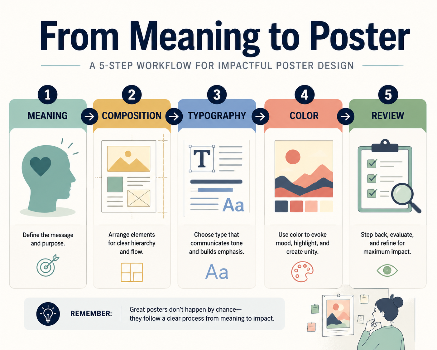
How to adapt the framework for your own poster ideas
You do not need to reuse the full long-form prompt every time. What you really need is the logic behind it.
For practical use, keep these editable inputs:
- core word or phrase
- language
- context
- emotional direction
- banned elements
Then preserve the structural rules:
- define the job as a concept poster
- force semantic interpretation before image generation
- require a support plane
- require one to three subjects only
- require giant embedded typography
- limit the palette
- keep a clear negative prompt block
That gives you a repeatable poster workflow without turning every prompt into unreadable prompt soup.
A simplified prompt structure you can actually reuse
Below is a shorter version of the framework translated into a more practical format for everyday poster experiments:
```text Create a high-end concept poster, not a generic illustration or text-effect image.
Core text: "[your word or phrase]" Language: "[language]" Context: "[optional context]" Emotional direction: "[optional tone]" Banned elements: "[optional exclusions]"
Before generating, interpret the meaning of the text:
- identify its emotional tone
- identify any paradox, contrast, or symbolic tension
- choose the most effective relationship between subject, space, and title
Composition rules:
- use a minimal but grounded scene with a clear support plane
- use 1 to 3 key subjects only
- make the title large, clear, and structurally important
- the title must function as part of the space, not pasted on top
Color rules:
- use a restrained 2 to 4 color palette
- prefer editorial, print-like, exhibition-poster color logic
- avoid cheap gradients, messy neon, and overdecorated effects
Negative prompts:
- generic poster template
- random small text
- disconnected typography
- clutter
- shallow illustration
- decorative effects without concept
```
That version is shorter, but it keeps the real engine of the original prompt intact.
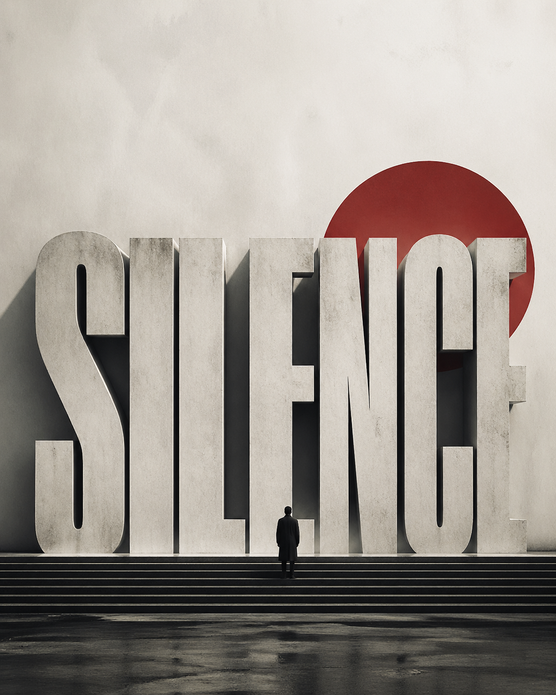
A practical example of GPT Image 2 poster design
Imagine your core phrase is Silence.
A weak prompt might say:
> design a minimalist poster with the word Silence, elegant typography, cinematic style
That will often produce something attractive but vague.
A stronger prompt logic would ask:
- what kind of silence is this?
- peaceful silence, oppressive silence, sacred silence, or post-conflict silence?
- what visual relationship expresses it?
- is the title a wall, a void, a horizon, or a blocked threshold?
Once you think that way, the composition changes. The subject may become very small. The title may feel like architecture. The support plane may become a stage-like empty field. The palette may shrink to off-white, charcoal, and one muted accent. That is the difference between decorative output and concept-poster output.
What GPT Image 2 is best at in poster work
Based on this framework and the current workflow behavior, GPT Image 2 is especially strong for:
- concept posters
- editorial-style title-led visuals
- exhibition-like compositions
- minimalist posters with one dominant message
- multilingual poster experiments where readable in-image text matters
It is less reliable when you need:
- long dense information layouts
- production-perfect typography with zero cleanup
- strict brand-system replication without iteration
- complex publishing grids filled with fine microcopy
That is an important distinction. GPT Image 2 is excellent for visual direction and concept development. It still benefits from human review if the poster has to become a final production asset.
How to use this workflow inside ImagineGo
This is where the workflow becomes practical rather than theoretical.
If you already have a concept and want to explore poster directions quickly, ImagineGo is useful because it lets you test layout-aware prompts faster without treating each attempt as a separate disconnected experiment. For broader exploration, you can also compare workflows across the Models directory and move between generation styles depending on whether your priority is text rendering, editing, or pure visual experimentation.
For this kind of poster work, the most productive path is usually:
1. define the word or phrase 2. define the emotional direction 3. map the semantic tension 4. build the composition rules 5. iterate on the title-subject relationship
That is a much stronger process than prompting from style words alone.
Final verdict
The reason GPT Image 2 poster design is suddenly interesting is not that the model can make prettier pictures. It is that the model is better at obeying a visual system when the prompt is written like a design brief.
That is exactly why the framework you shared works. It does not rely on hype language. It defines semantics, structure, typography, color discipline, and quality control in one coherent system.
If you use GPT Image 2 that way, it becomes far more useful for concept posters, editorial graphics, and message-led visual experiments. If you treat it like a normal image model and only throw style adjectives at it, the results will usually stay shallow.
The practical takeaway is simple: poster quality comes from prompt architecture, not prompt decoration. And if you want to test that workflow directly, you can start iterating the same logic on ImagineGo.