이미지 프롬프트
Infographic / Edu Visual - Korean Makeup Analysis Guide
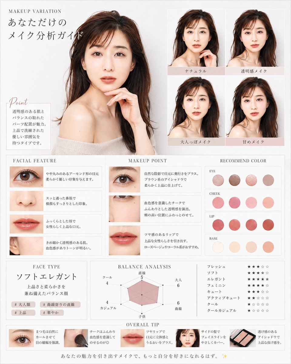
Creates a luxury Korean beauty magazine-style makeup analysis infographic with portraits, feature notes, color recommendations, ratings, and overall tips.
Korean Makeup Analysis Guide Prompt
Goal: Create a luxurious Korean-style beauty magazine infographic titled as a personalized makeup analysis guide for you, using a translucent, elegant female model with dewy skin, long dark brown hair, bare shoulders, and soft beige knit styling. The design should feel like a high-end cosmetic consultation sheet in white, ivory, pale gray, blush pink, and warm beige.

Canvas: Vertical poster, approximately 4:5 ratio, clean white-to-light-gray background, thin pale gray borders, delicate serif typography, airy spacing, soft natural lighting, polished editorial photography look.

Main layout: Place one large bust-up portrait of the female model on the upper left, occupying about 40% of the canvas width and 45% of the height. She faces forward in a graceful pose with one hand near her chin, glossy brown hair, off-shoulder cream top, luminous skin, and a calm feminine mood. At the top left, add small English text “MAKEUP VARIATION” and a large Japanese headline “あなただけの メイク分析ガイド”.

Point box: Under the large portrait, add a small bordered note box with the script heading “Point” and Japanese body copy describing clear skin, balanced features, pearl placement, and a refined elegant atmosphere.

Makeup variation grid: On the upper right, create exactly 4 smaller portrait tiles in a 2×2 grid, each showing the same woman with subtle makeup differences. Add pale blush label bars under each tile with these 4 Japanese labels: “ナチュラル”, “透明感メイク”, “大人っぽメイク”, “甘めメイク”.

Middle analysis area: Create three adjacent boxed columns across the middle.
1. “FACIAL FEATURE” column: exactly 4 horizontal feature rows with close-up photos and Japanese descriptions: one eye close-up, one nose close-up, one lips close-up, one ear/skin-side-face close-up.
2. “MAKEUP POINT” column: exactly 3 horizontal rows with close-up photos and advice text: eye makeup close-up, cheek/under-eye close-up, lip close-up.
3. “RECOMMEND COLOR” column: show exactly 16 circular color swatches grouped into 4 labeled rows with 4 swatches each. The labels are “EYE”, “CHEEK”, “LIP”, and “BASE”. Use muted rosy browns for eyes, soft pink-coral for cheeks, vivid rose-red/coral for lips, and ivory-peach-beige for base.

Lower analysis area: Create three boxed sections.
Left section “FACE TYPE”: large Japanese face type text “ソフトエレガント”, a short Japanese description about a balanced face with elegance and softness, and exactly 4 small hashtag chips: “# 大人顔”, “# 曲線寄りの直線”, “# 上品”, “# 華やか”.
Center section “BALANCE ANALYSIS”: a pink translucent radar chart with exactly 6 axes labeled in Japanese: “直線”, “大人”, “曲線”, “子供”, “カジュアル”, “クール”, with small numeric values around the chart.
Right section: exactly 8 Japanese style rating rows using star icons, labeled “フレッシュ”, “ソフト”, “エレガント”, “フェミニン”, “キュート”, “アクティブキュート”, “クール”, “クールカジュアル”. Use mostly black filled stars and pale gray empty stars.

Bottom strip: Add an “OVERALL TIP” section with exactly 5 compact tip cards in a horizontal row: eye close-up card, makeup brush on cheek card, lips close-up card, small face portrait card, and eyeshadow palette card. Each card includes a tiny image and short Japanese makeup advice text.

Footer: Add a centered Japanese closing sentence along the bottom: “あなたの魅力を引き出すメイクで、もっと自分を好きになれるはず。 ✨”

Visual style: Minimal luxury beauty editorial, Korean transparent-skin aesthetic, soft shadows, thin dividers, blush beige accent bars, elegant serif headings, delicate script for “Point”, realistic cosmetic photography, harmonious spacing, no clutter.

Customizable details: The model should have dark brown hair, clear dewy translucent skin, the overall accent palette should be pale blush beige, and the face type should read ソフトエレガント.

Constraints: Keep all Japanese labels legible, use exactly the element counts specified, maintain the same editorial grid structure, avoid logos or watermarks, and do not add extra sections.