Infographic / Edu Visual - Grok AI Editorial Infographic Poster
A complex editorial infographic prompt that visualizes the Grok AI architecture and history in a dramatic National Geographic style.
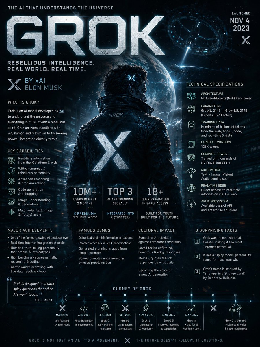
完全なプロンプトを見る →Search the web for detailed information about Grok AI including its development history, underlying architecture, technical capabilities, training methodology, real-world applications, cultural impact, major breakthroughs, controversies, notable model versions, and surprising lesser-known facts. Then create a dramatic editorial infographic poster in the style of a National Geographic feature — but for groundbreaking artificial intelligence. The most powerful and recognizable visual representation of Grok is the full-bleed atmospheric hero filling the entire poster top to bottom, dramatically lit and color-graded in deep black, electric blue, chrome silver, and cosmic neon tones matching Grok’s rebellious futuristic identity. Oversized bold typography with the word ‘GROK’ dominates the upper portion in a sleek sci-fi font inspired by space technology and cyberpunk interfaces. Text and graphic panels float naturally over the image as editorial overlays — not boxed magazine layouts. Include: release year and creator/company (xAI / Elon Musk), model architecture and parameter scale, training data scale and computing infrastructure, key capabilities and benchmark performance, integration with X (Twitter), adoption statistics and market influence, launch milestones, famous public demos, major achievements, cultural significance, and 3 surprising lesser-known facts. A technical specification panel on one side showing architecture, multimodal abilities, reasoning features, context window, API ecosystem, and compute power. A timeline of Grok’s major breakthroughs and releases along the bottom. Include references to real-time internet integration, humor-driven personality, open-source initiatives, and competition with other frontier AI models. Color palette and mood drawn entirely from Grok’s own visual identity — cinematic, edgy, intelligent, futuristic, slightly rebellious. No white background, no magazine grid, no boxed sections. Everything layered organically over the full-bleed hero image. Aspect ratio 4:5. Dense, tactile, cinematic, unmistakably Grok.
英語
Infographic / Edu Visual - Manga Recipe Illustration Generator
An image-to-image prompt for creating casual, humorous manga-style recipe pages with character consistency and a lighthearted vibe.
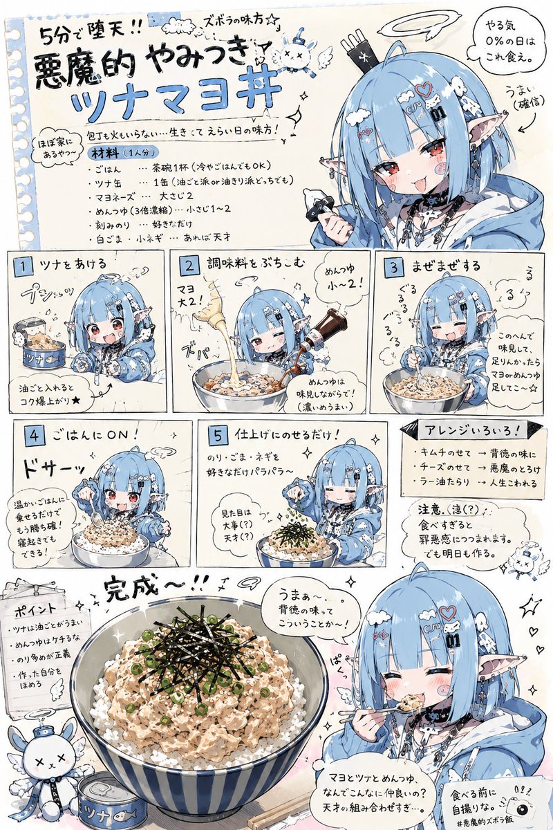
完全なプロンプトを見る →Please create a "easy recipe introduction illustration page" using the character from the reference image, with a humorous and relaxed atmosphere.
Use the provided image only as a character reference. Do not reuse the composition, pose, background, camera angle, or layout of the original image.
The AI should freely devise the recipe content.
The cooking genre should be simple dishes within a realistic range, such as lazy meals, simple snacks, late-night snacks, budget meals, junk-style snacks, leftovers cooking, convenience store arrangements, or quick side dishes.
The overall screen should have the atmosphere of a Japanese online recipe article, a magazine bonus page, a casual personal blog, an SNS meme image, or a relaxed manga.
Structure: - Include multiple step-by-step panels - Put an SD/chibi version of the character in each step - Include reactions or small jokes during cooking - Include flustered faces, smug faces, a sense of messy work, small accidents, mysterious momentum, etc. - Include hand-drawn style arrows, notes, supplementary comments, and rough warnings - Make the layout slightly cluttered - Ensure high information density but keep it readable and organized.
Even if the presentation is gag-oriented, make the food look appetizing enough to make someone think, "Maybe I'll try making this."
At the bottom of the image, place a large main cut showing the finished dish.
Include a scene where the character themselves is eating the dish, with a speech bubble for their impressions.
The impressions should be surprisingly persuasive, silly, weirdly high-energy, but making one want to eat it.
Important: - Do not make the food look unappetizing - Do not go in the direction of high-end cuisine or formal restaurants - Do not use an overly clean minimal design - Do not make it a lifeless infographic - Emphasize manga-style reactions and a sense of daily life - Balance a relaxed atmosphere with practicality - Maintain the character's face and identity.
日本語
Infographic / Edu Visual - Cream Style China Divorce Data Chart
Generates a warm cream-toned 3D editorial infographic visualizing China divorce counts from 2020 to 2026 for social media or presentation use.
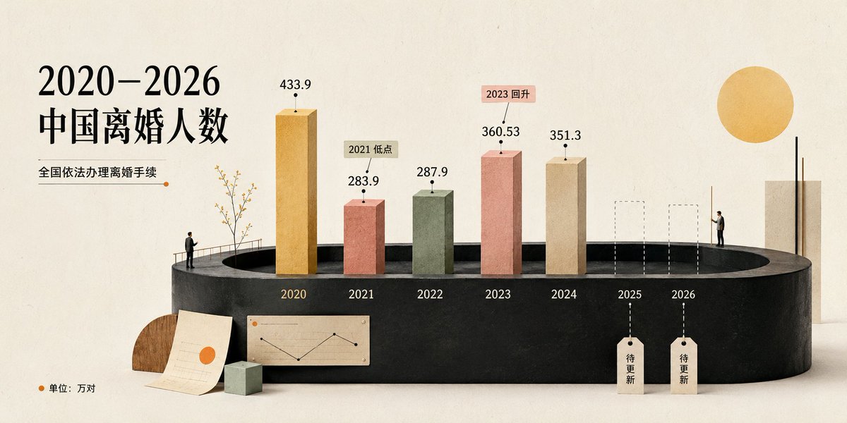
完全なプロンプトを見る →Goal: Create a cream-style editorial data visualization poster about 2020–2026 中国离婚人数, showing the number of divorces in China from 2020 to 2026 as a miniature 3D bar chart installation.
Canvas: Wide horizontal 16:9 composition, warm ivory paper background with subtle grain, soft studio lighting, lots of negative space, refined magazine-infographic look.
Layout: Place the large black serif Chinese headline on the left, split into two lines: “2020–2026” and “中国离婚人数”. Under it add the subtitle “全国依法办理离婚手续” with a thin horizontal line ending in a small orange dot. Along the bottom-left corner add an orange dot and the note “单位:万对”. The main chart sits across the lower middle on a matte black oval/cylindrical platform, viewed in slight perspective. Year labels are printed on the front edge of the platform.
Data and chart elements: Use exactly 7 year positions labeled 2020, 2021, 2022, 2023, 2024, 2025, 2026. Show exactly 5 solid 3D vertical bars and exactly 2 future placeholder bars. The 5 solid bars are: 2020 tall golden bar labeled “433.9”; 2021 shorter terracotta red bar labeled “283.9” with a beige callout tag “2021 低点”; 2022 muted sage green bar labeled “287.9”; 2023 salmon pink bar labeled “360.53” with a pink callout tag “2023 回升”; 2024 beige bar labeled “351.3”. The 2 future placeholders are: 2025 and 2026 shown as dashed-outline transparent rectangular columns, each with a dashed vertical guide line dropping to a hanging paper tag that reads “待更新”. Use black dot markers above bars and thin leader lines for the value labels and callouts.
Decorative scene details: Add tiny human figures for scale: one small man standing at the left edge of the platform near a delicate leafless decorative tree and railing, and one small man standing near the right side beside the future columns. Add a small paper sheet with a simple line chart and orange dot leaning in front of the platform, a small pale green cube, and a semicircular wooden accent behind the paper. On the far right add a tall beige rectangular slab with two thin black vertical rods and a large golden sun-like circle above it.
Visual style: Soft cream aesthetic, tactile paper and clay textures, muted palette of black, ivory, ochre, terracotta, sage, salmon, beige, and warm wood. Elegant serif typography for the headline, clean minimal sans-serif for numbers and small labels. Use realistic soft shadows, miniature diorama scale, high-end editorial data visualization, calm and polished.
Constraints: Keep all visible text in Chinese exactly as specified, use the exact 7 year labels and the exact 5 numeric values, do not add extra bars, legends, logos, watermarks, or unrelated text.
英語
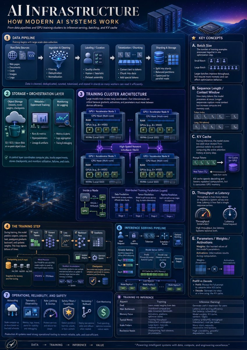
Infographic / Edu Visual - AI Infrastructure Infographic Poster
A dense futuristic educational poster explaining modern AI systems, useful for technical presentations, learning materials, and social media informationals.
完全なプロンプトを見る →Goal: Create a highly polished vertical educational infographic titled AI INFRASTRUCTURE with the subtitle HOW MODERN AI SYSTEMS WORK, explaining modern AI infrastructure from data pipelines and GPU training clusters to inference serving, batching, and KV cache.
Canvas: Vertical poster, 4:5 aspect ratio, dark navy futuristic data-center aesthetic. Use a glowing blue/purple cyber grid background with mountains, server racks, a GPU chip illustration, neon circuit traces, thin rounded panels, white and cyan typography, and small orange numbered badges. The overall look should resemble a premium technical explainer poster, dense but readable.
Layout: Large title across the top left, small subtitle and tagline below it, decorative server racks and GPU chip on the top right. Arrange the content into exactly 8 numbered main sections plus a right-side “Key Concepts” column and a bottom flow footer. Use precise panel borders, small icons, arrows, diagrams, tables, and micro-labels.
Sections and required content:
1. Data Pipeline: Show exactly 5 pipeline stages connected by arrows: Raw Data Sources, Ingestion & Cleaning, Labeling / Curation, Tokenization / Chunking, and Sharding & Storage. Raw Data Sources contains exactly 5 bullets: Web pages, Documents, Code, Images, Logs. Ingestion & Cleaning contains exactly 3 bullets: Filtering, Deduplication, Normalization. Labeling / Curation contains exactly 3 bullets: Quality checks, Human / heuristic, Dataset assembly. Tokenization / Chunking contains exactly 3 bullets: Convert text to tokens, Chunk into docs, Add special tokens. Sharding & Storage contains exactly 3 bullets: Split into shards, Balanced partitions, Optimized for parallel reads. Add a caption stating that data is cleaned, deduplicated, curated, tokenized, and stored in shards so many workers can read it efficiently.
2. Storage + Orchestration Layer: Include exactly 3 vertical cards: Object Storage with a cloud-to-database icon and note “S3 / GCS / Azure Blob or on-prem object store”; Metadata / Experiment Tracking with a dashboard icon and bullets “Runs & metrics,” “Hyperparameters,” “Lineage & artifacts”; Monitoring & Logging with a chart/magnifier icon and bullets “Metrics & alerts,” “Logs aggregation,” “Tracing & debugging.” Add a footer note that the control layer coordinates compute jobs, tracks experiments, stores checkpoints, and monitors utilization, failures, and costs.
3. Training Cluster Architecture: Large central architecture diagram titled Training Cluster Architecture. Show exactly 4 GPU / Accelerator Node boxes in a 2x2 grid connected by glowing high-speed network links labeled “High-Speed Network InfiniBand / RoCE.” Each node contains CPU Host (Multi-core), RAM, GPUs such as 8x H100, and NVMe local SSD. Add dotted links between nodes. Below, include exactly 3 mini-panels: Inside a Node, Data Parallelism, and Distributed Training Parallelism (Legend). Inside a Node should show CPU connected by PCIe/NVLink/NVSwitch lines to multiple GPUs. Distributed Training Parallelism legend should show exactly 4 stages labeled Stage 1, Stage 2, Stage 3, Stage 4.
4. The Training Step: Create a left-to-right training flow with exactly 6 stages: Input Tokens, Forward Pass, Loss Compute, Backward Pass, Gradients, Optimizer Update. Include a checkpointing icon stack, a “Model Precision” box mentioning FP32, FP16/BF16, FP8, and an “Optimizer State” box. Show gradient accumulation arrows and a caption explaining that during training, the model predicts outputs, computes loss, propagates gradients backward, and updates weights, repeated billions of times.
5. Inference Serving Pipeline: Create a compact serving diagram with exactly 6 stages across the top: User Request, API Gateway, Tokenizer, Scheduler / Router, Model Server (GPU), Streamed Output. Inside the panel include Dynamic Batching with exactly 3 request rows, a Model Server box showing Prefill and Decode Loop, KV Cache on GPU Memory, optional adapters, and a load balancer connecting exactly 3 model replicas labeled Model Replica 1, Model Replica 2, Model Replica N.
6. Operations, Reliability, and Safety: Include exactly 6 operational cards with icons: Autoscaling, Telemetry / Observability, Rate Limiting & Quotas, Safety Filters / Guardrails, Versioning / Rollback, Cost Monitoring. Add a note that production AI systems need strong operational tooling to remain reliable, safe, and cost-efficient.
7. Training vs Inference: Add a comparison table with exactly 6 rows: Goal, Main Bottleneck, Memory Focus, Typical Metric, Scale Pattern, Resilience Needs. Use two columns labeled Training and Inference (Serving). Training should describe learning model weights from data, distributed compute and data movement bandwidth, activations/gradients/optimizer states, tokens per second or convergence, large batch long jobs, and checkpointing/fault tolerance. Inference should describe generating useful responses for users, latency and throughput, model weights plus KV cache, latency and tokens per second, many short requests, and high availability/graceful degradation.
8. Key Concepts right column: Create a tall right sidebar titled Key Concepts containing exactly 5 lettered cards: A. Batch Size, B. Sequence Length / Context Window, C. KV Cache, D. Throughput vs Latency, E. Parameters / Weights / Activations. Card A should define batch size and show small batch versus large batch with token/person icons. Card B should show prompt tokens and long context as token blocks labeled T1, T2, T3, T4, …, Tn. Card C should show prompt tokens feeding a purple cylindrical KV Cache, then a new token reading from cache. Card D should show exactly 2 gauges: Throughput and Latency. Card E should show weights and activations as blue and purple grids connected by multiplication. At the bottom of the sidebar add a small “Prefill vs Decode” note explaining prefill processes the full prompt and decode generates one token at a time using the KV cache.
Footer: Add a bottom navigation strip with the sequence “DATA → TRAINING → INFERENCE → VALUE,” a small circular rocket/compass-style icon at left, and a closing quote: Powering intelligent systems with data, compute, and engineering excellence.
Visual style: Dense corporate technical infographic, crisp vector and semi-3D icons, glowing cyan outlines, subtle gradients, volumetric light, small schematics, miniature charts, and clean serif title typography with modern sans-serif labels. The color palette should be deep navy, electric blue, cyan, violet, white, and small amber accents.
Constraints: Use exactly 8 numbered main sections, exactly 5 key concept cards, exactly 4 GPU nodes, exactly 6 training-step stages, exactly 6 inference stages, exactly 6 operations cards, and exactly 6 training-vs-inference table rows. Keep all visible text in English, avoid watermarks, avoid brand logos, and maintain high readability despite the dense layout.
英語